I came across Hugo Richard's site, and my first impression was that it looked like any other modern, clean site: relaxed white space and nice visuals.
A few days later I was still going back to hunt for its details. The theme is based on London, where he lives, and it follows the time of day. At dawn, at golden hour and at night, every element takes on the hue of the moment. By then I knew I would have to reverse-engineer it properly, to learn all the small details and surprises he had put in. He has written about redrawing his portfolio himself.
Agents have made fancy 3D and cool animation easy. Next to all that, Hugo's site gave me a sense of calm. I took it for restraint. After redesigning my own site on his, I realised it wasn't restraint at all. It was the highest form of design.
Where I started
Hugo began with the things he loves and let each one leave a mark on the page. So I filled in a sheet of questions about mine. Three things came out of it.
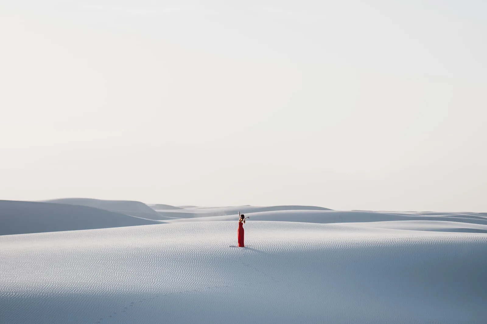
Photography. Nature, peace, being in the moment. This one ended up shaping more of the site than anything else: the colour, the light, and the lens drawn further down.
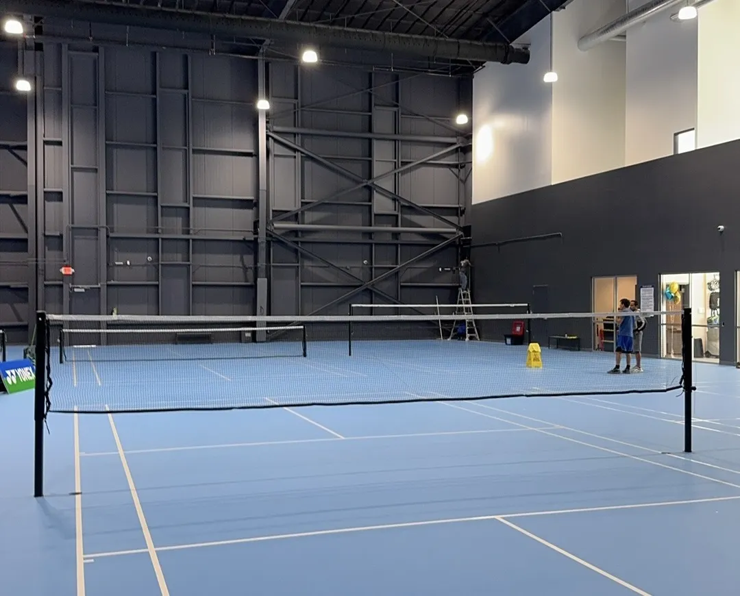
Badminton. Strategy and coordination, and the slow work of understanding a movement well enough that it becomes muscle memory. It left no visible mark. It left a rule: understand how a thing works, then repeat it until it's effortless.
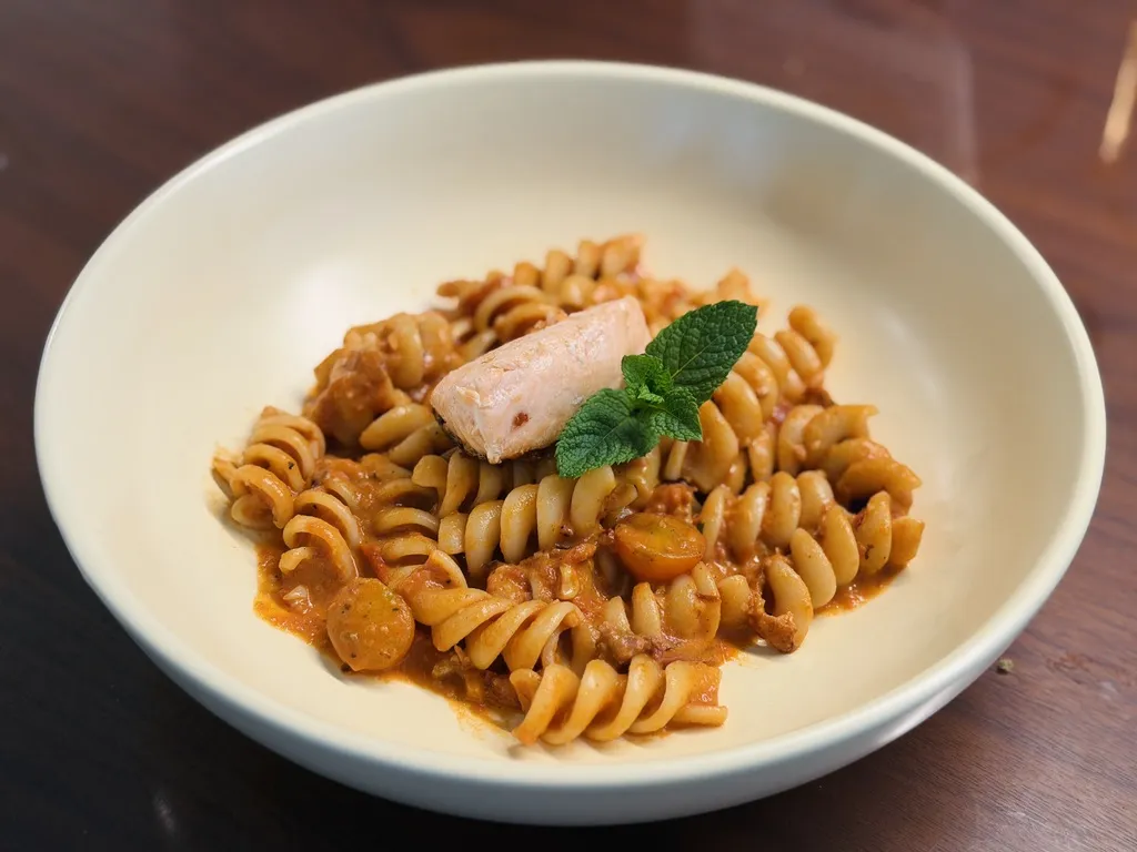
Cooking. We spend about four years of our lives eating, so the process should be fun. I get a little faster every time: cutting, cleaning as I go, running dishes in parallel. I still don't know what cooking leaves on the page. For now it is the reason I keep refining things nobody asked me to refine.
The sheet also asked what the site should never be: busy, jarring, flashy, corporate, templated. And what to leave out: gradients, and an About section. People should know me by what's on the page.
Light
The page has no light theme and no dark theme. It has a day.
The site works out where the sun is over Austin right now and lights the page from it. The paper is a cool blue-grey just after sunrise, a warm near-white at noon and amber at golden hour. After sunset it darkens through dusk to an almost-black.
18:08 · dusk
The sun over Austin, looking south. The rim is the horizon. Each dot is an hour of today, filled with the page's paper at that hour. Drag the time to move the sun, and the page's light with it. After sunset it goes on under the horizon as a moon.
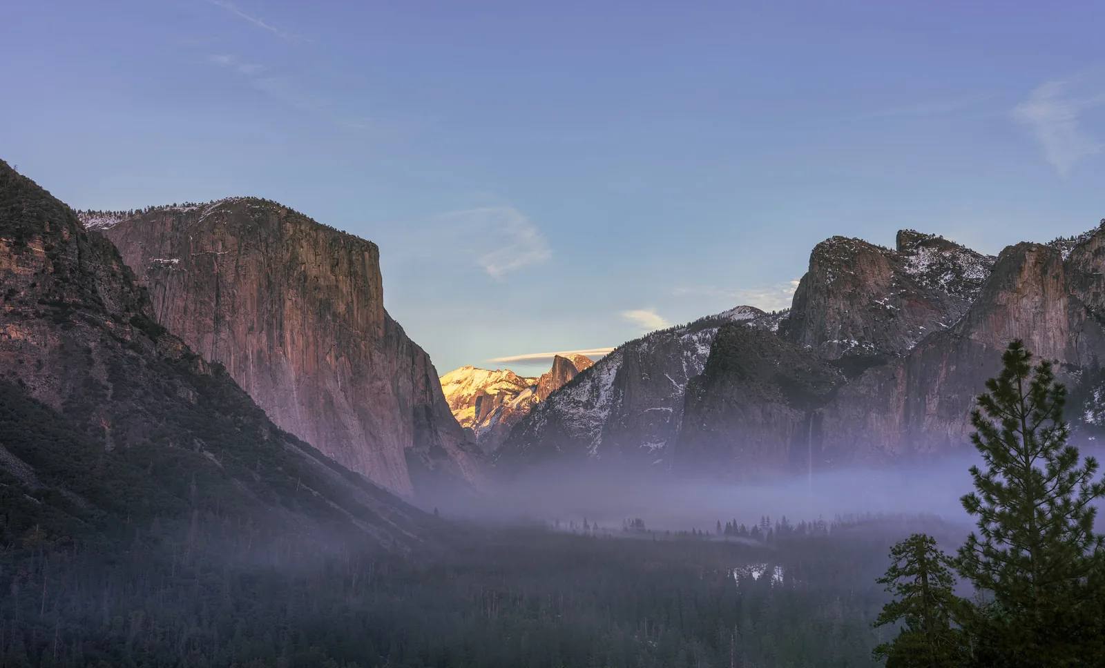
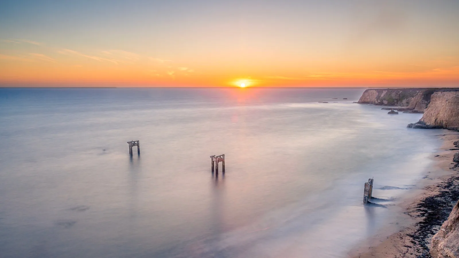
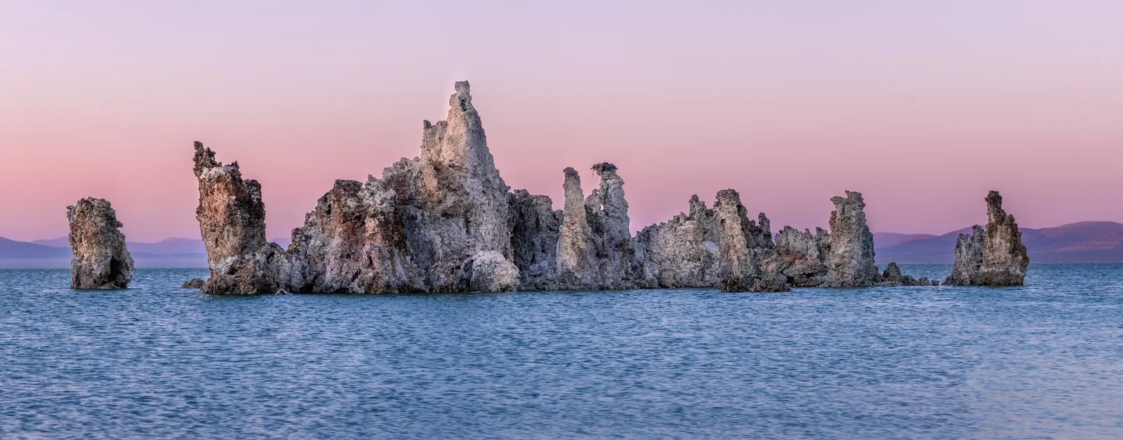
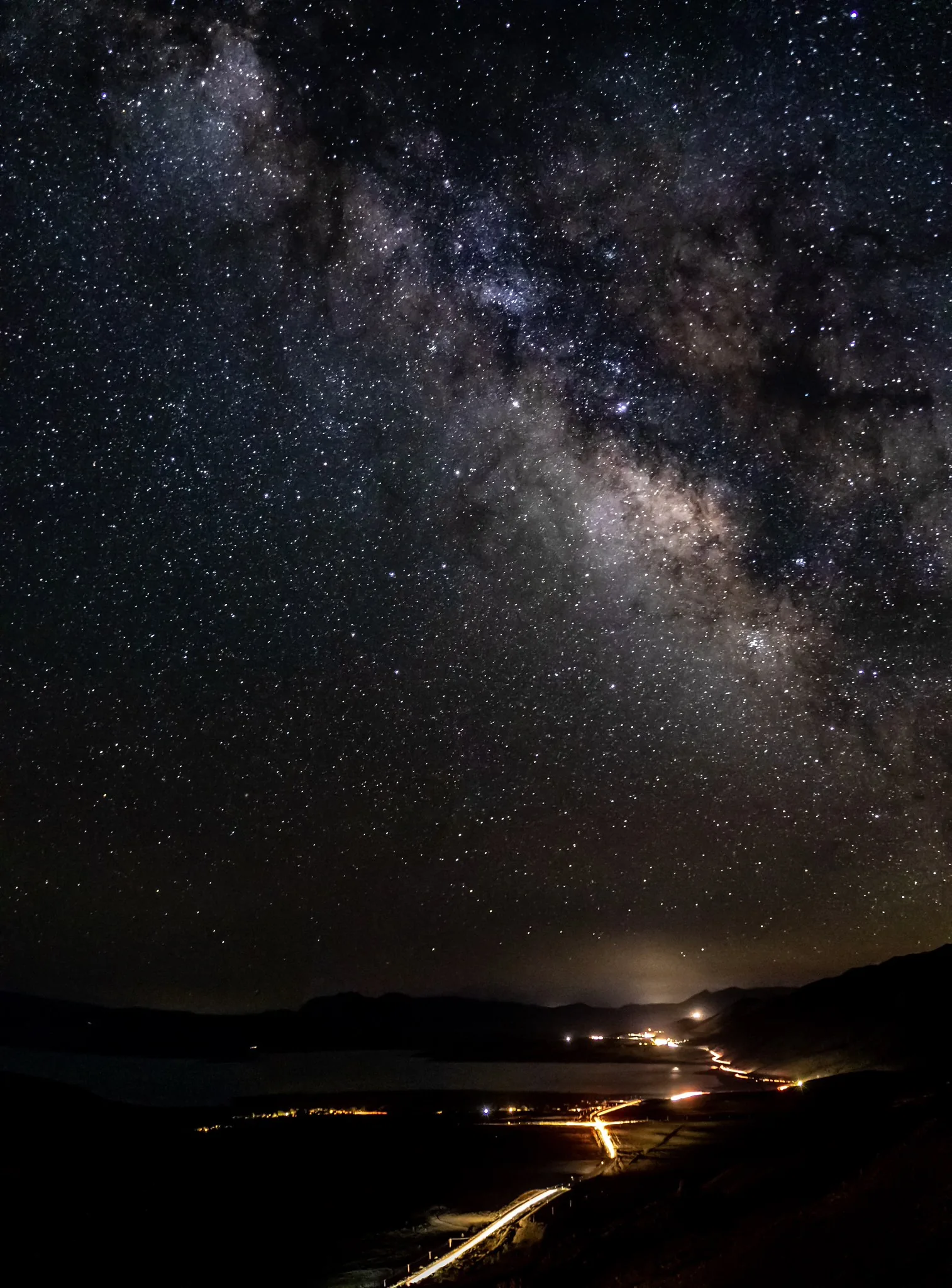
These are the lights I had in mind. They are my own photographs, set in the order the page's day runs: cool, bright, warm, dusk, night.
The one colour on the site is a soft green I call Nature. It comes from being out with a camera at dawn, at noon and at golden hour. I set it as the theme's accent token, and everything that needs a colour takes it from there: links, marks and the focus ring.
The accent is re-lit by the same light as the paper, so its hue drifts through the day: toward teal at dawn, toward leaf green at golden hour, and back to exactly the colour I picked at night. Almost nobody will notice. That is the point of it.
Whatever the light does, the text stays readable. Muted text and the accent as text hold 4.5 to 1 against the paper, and the accent as a mark holds 3 to 1: the WCAG 2.2 AA figures. One function, fitL, finds the lightness that gets there.
My first version faded smoothly from light to dark, and for a few minutes at sunrise and sunset the page was a muddy grey that nothing could be read on. Now it flips. The page is on its light side or its dark side, never in between.
The lens
The lens in the drawing is my favourite: the Sony FE 70-200mm F2.8 GM OSS II. I used to shoot with the f/4 version. My wedding photography and live stream business earned the money for the f/2.8, and I was very excited the day I bought it.
The difference was night and day. The bokeh is silky smooth, and it separates the subject crisply from the background. At the same aperture, the vignetting is dramatically lower than the f/4's. The zoom is internal, so nothing on the outside moves, which saved me many times in a drizzle. And its stabilisation, working with my camera's own, feels like holding a gimbal in my hand.
It has been through dust, drizzle, valleys and mountains with me since, and it means a lot to me.
FE 70-200 MM F2.8 GM OSS II ø77 · 11 BLADES · F2.8–22
The grid
The layout is borrowed directly from Hugo, because I found it easy to read and easy to compose on. One plate, 1024 wide: an index column, a reading column and a column for notes. On smaller screens the reading column holds its width as long as it can and the margins give way first.
The plate, as its sheet draws it. Each code is a width, and the table gives it at wide, medium and narrow.
The sections are lettered αAlpha, βBeta, γGamma. That comes from the Sony Alpha mark on the camera.
Underneath
Press D, or use the Markup control in the footer.
The site has a second face: a dimensional drawing of itself, laid over the live page. A ruler across the top shows the real width of every column, and at the next level the gaps and heights are dimensioned too. Every number is measured from the page you are looking at, so it stays true when you resize the window. It is drawn in the page's own ink, which means the drawing follows the sun as well.
There is more under that. Every page has a sheet underneath it: a dimensional drawing of that page, with slots where the words go and the working behind every size. The way down is in the page's corners. Each one holds a small pentalobe screw. Undo one and the page lifts and slides away.
The pentalobe is the screw Apple uses: a precise, hidden fastener. To me it stands for a strong foundation and meticulous attention to detail, which is my own obsession with pixel-perfect design. The sheets come from Apple too. Its dimensional drawings are an X-ray of each product. They look sleek as engineering, and they are a detailed record of the design. Mine do the same for the UI, and give me a reliable guide for future iterations.
A page held by three corner screws over its dimensional drawing; the top left corner has none.The surface, screwed down over its sheet. Point at a corner to loosen its screw, and press to take the page away. Press again to put it back.
The footer
Most footers look templated and carry a lot of links, and that makes a page feel busy. I wanted mine to be as minimal as it could be. I thought about a copyright line, a GitHub link, a résumé, privacy and terms. Any one of them would have undone the calm of the rest of the site.
So the footer holds three controls and nothing else: markup, light and sound. At rest they are only icons. When you reach for them they open into labels, and each one has a tip that describes it. Screen readers get the labels either way.
It took six phases to get there. Each one added a single idea, and the figure walks through them.
Markup0LightSunSoundOff
Phase 1 · In the corner
At first the controls were pinned to a corner of the window, over whatever was there. Nothing else on the site floats over the content.So they came down into the page as its last row, centred. There are three on purpose: an odd number has a middle, so the pill’s weight is balanced.Three labelled buttons said more than a footer needs. At rest they are icons, and they open when you point at them. On a phone the first tap only opens the pill, so a tap never acts before it shows what it does.Then the words started to go. The markup’s level moved from a digit into its icon, and the light lost its label. Each icon should carry part of its meaning without one.A press used to swap a long word for a short one, and the pill shrank under the pointer. Now each control is as wide as its widest value, and FOLLOW SUN became SUN. The tips are still loose: point at each control and watch them jump.Each tip sat centred over its own control, so it jumped as you moved between them and hung over the pill’s edges. Now every tip is anchored to the pill’s centre. Point at each control here, then in the phase before.
Holding still challenged me the most. What feels good to use and what is easy to understand often get in each other's way. In the end I chose the simpler label, SUN, and rewrote the tip to do the explaining.
Where it leaves Hugo's
There is a saying: "Good artists copy; great artists steal." I think the heart of it fits what I did with Hugo's site.
What I enjoyed most there were the parts that go past a flat page: the page underneath, the not-found page, the level of detail. I took those ideas and blended them with what I know best, which is animation and accessibility.
I took one of the few classes in the U.S. that is about accessibility alone, Accessible User Experience at UT Austin, taught by Professor John Neumann. It gave me confidence, and principles to hold the site to.
You can see them at work. Raise the markup to its highest level and it becomes an inspector. Point at any element and it shows what the element is in the HTML, and the values the W3C's guidelines ask of it.
That is where the two sites part. The structure is Hugo's. The path through it shows who I am and what I do best.
How it was built
I built this with Claude Opus and Fable. Here's how.
I made the decisions. The agents did the building, and they delegated their work to sub-agents. What I gave them was guides, skills, a direction for the look, and primitives for each part:
The sheets underneath. The dimensional-drawing skill, with twists so the drawings use the site's own tokens.
Animation. The review-animations skill and the other animation skills by Emil Kowalski.
UI components.ui-sdk, a new open-source library of agentic components. Its components define their APIs for both humans and agents, so an agent can control and test them efficiently.
Setting these principles early made the work faster and more accurate. It is why the whole site could be built in two days, with this much polish and taste.
AI is only as helpful as the fundamentals I have learned. I have built websites with many technologies and ways of rendering: SPA, SSR, PPR. I know CSS by its own terms: route transitions, selectors and their syntax, the media features each platform supports. And I know the niche details of accessibility in modern frameworks.
All of it rests on the basics I learned first. They are the keywords I use to guide the models toward high-quality output.